Design Takes - May 2025
This month’s topic came about while I was researching materials to create a moodboard for a project in the medical field. Although I wasn’t specifically looking for a subject for my monthly Design Takes, something I came across during this process caught my attention — and I thought it would make an insightful subject of study.

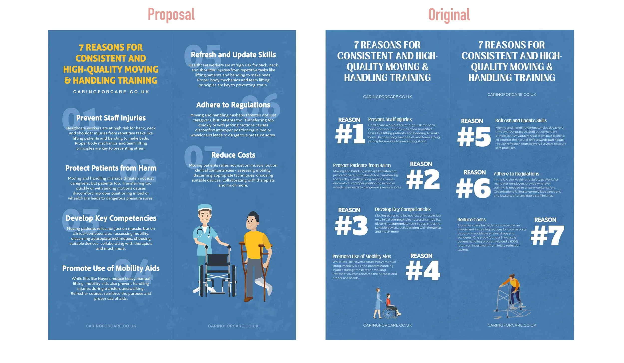
This is a material that popped up on Pinterest and I believe it was conceived as a printed flyer due to its visible middle line and duplicated title.
While the image is clean and straightforward, a few typographic adjustments could enhance its overall impact.
If you look at each section containing a number and its accompanying text, you’ll notice a clear contrast — but also a significant imbalance in the weight between the number, title, and paragraph. I appreciate the visual emphasis on the numbers, but unfortunately, the titles are a bit difficult to read.
For this analysis, I used typefaces that closely resemble the original, as I wasn’t certain of the exact fonts used.

As I wrote above next to be proposed layout I made, my focus was on titles and imagery—these elements have the strongest impact, especially in a “diagonal reading” scenario. By that, I mean that most people don’t read everything word for word; instead, they scan from left to right, picking out the most prominent elements. With that in mind, I aimed to make both the content and imagery clearly convey the topic, allowing readers to grasp the subject at a glance.
Additional to this layout analysis you should also consider the purpose of the layout - will it be printed, used digitally, or adapted for both? Will it need to be adjusted to different aspect ratios? These considerations should guide your decisions on typography, font choices, and illustration styles to ensure clarity and consistency across formats.
Heres a better view of both side by side. I hope the updates are suggestive enough and that it will help you become a good layout and type observer. :)
If you made it this far in this article, I very much thank you and congratulations, you’ve learned something, even if maybe it was just out of curiosity. :)
While the focus is more on analysis than correction, these monthly sessions are all about exploring what’s out there, brainstorming, understand and why not, make it better.
If there’s something you’d like me to review for these sessions, feel free to send me an email! I’d be happy to take a look and include it in an upcoming article.