Design Takes-Nov. 2024
Another month has flown by, and I’m back with the November session of Design Takes.
This time, we’re exploring the design of some everyday items and quick ways they could be improved.
These products caught my eye during my weekly shopping trip, and I realised they were perfect timing for this article!
I really hope you’ll find these brief sessions useful. Even if they give you just a small new perspective, I’ll consider that a win each month!
And if there’s a layout or design you’d like me to take a look at, feel free to send it over, and I’ll include it in an upcoming session.
First Up - Range Farm Eggs

Not so Pro
typeface choices
contrasts between illustration, background & type
illustration in relation to the type and layout
layout itself
Pro’s
Key elements are there - the chicken and the word “Range” are pretty much self explanatory.
A fair choice of colours for what the product stands for.

is “Range Farm” the name of the farm or... ?
The business name in white lacks impact.
The letterforms are very thin and don’t relate to each other.
The layout feels unbalanced, with elements placed without clear hierarchy.
The quality stamps ("British Lion Quality" & "British Produce") are too faded into the background, despite being essential to the brand statement.
Here’s My Approach

What’s Different
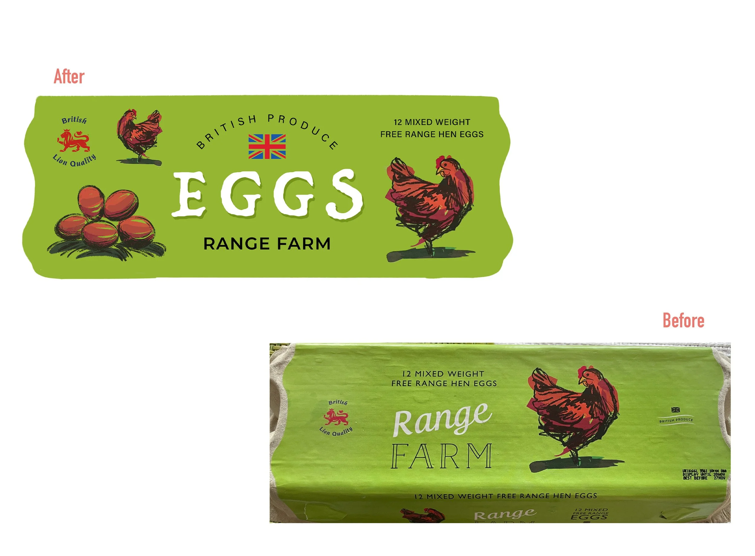
Highlighted illustrations, title and accents
I sketched some eggs staying as close to the style as possible
Balanced layout and refined the typography
This is for analysis purposes; further details and adjustments are recommended for a live rebrand.
Next One Up: Wine Bottle
I hope you find this readable, it’s difficult to show a “warped” label :D

Another type related issue, a bit more difficult to reflect in a picture but still nice to study.
Type based layout require a more profound typography principles especially for small labels/etiquette products.
Calligraphy has always been the no.1 choice for wine labels along with very delicate fine art illustrations, which gives elegance, a sense of trust and profesionalism.

Another kerning issue - the “eau” group is too tight, while the “ola” group in “Beaujolais” is unevenly spaced.
Beyond the kerning problem, the designer added letter spacing, which is almost impossible with calligraphic fonts due to their specific connectors. Adjusting spacing in .psd/.ai files causes the letters to appear disconnected (though this might not be fully visible in these JPGs).
Calligraphic fonts are very tedious because of their connectors, they need to perfectly fit into one another while typing (if you want to get it even harder, think about ligatures), they can also look “different” in other languages beside English so, to my opinion, they are the most tedious category of font making process.
If you made it this far in this article, I very much thank you and congratulations, you’ve learned something, even if maybe
it was just out of curiosity. :)
While the focus is more on analysis than correction, these monthly sessions are all about exploring what’s out there, brainstorming, understand and why not, make it better.
If there’s something you’d like me to review for these sessions, feel free to send me an email!
I’d be happy to take a look and include it in an upcoming article.